SEO migration for Shift to Solar

Solar canopies and a customised SEO migration

Meet Shift to Solar, a pioneer in the solar canopy market. Faced with limitations in the old CMS and disappointing conversions, we joined forces for a seamless migration to WordPress. This case demonstrates how an updated website design and a successful migration can help improve both organic findability and conversion rates.
image about company logo

At a glance

Challenges

  • Creating a conversion-oriented design for the new website
  • Devise and implement new URL structure and navigation
  • Expanding the design with opportunities for helpful content
  • Migrating to WordPress zonder significant dip in traffic

Results

  • Website with structure, primary and secondary navigation
  • Attractive design with extensive content blocks
  • Increase in conversions from 16 per month to several per day!
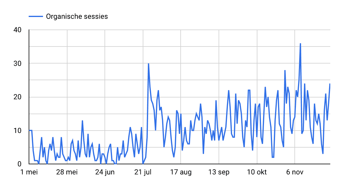
  • Doubling of organic traffic

Starting point

Solar canopies are a fast-growing market. Shift to Solar started as a provider of solar bicycle shelters, but soon added solar carports and solar panels on (company) roofs. We were asked to improve the organic findability of the website, but in doing so, we quickly ran into CMS limitations. 

Services were expanding, but it was very complicated in the old CMS to create good pages for this due to the lack of blocks and sub-navigation. Our SEO efforts increased the number of website visitors, but conversions lagged behind. So a migration to a new system was much needed! 

Growth in organic traffic, but conversions lagged behind

Since starting the SEO trail, we saw nice organic growth, but this did not lead to more conversions. Adjustments to the CMS were possible, but very cost-intensive. Therefore, we finally decided to switch to WordPress.

As a result, the migration is not only a SEO migration been: the design was completely redesigned and optimised for conversion. In consultation, we determined which elements were necessary in the new design to increase conversions.

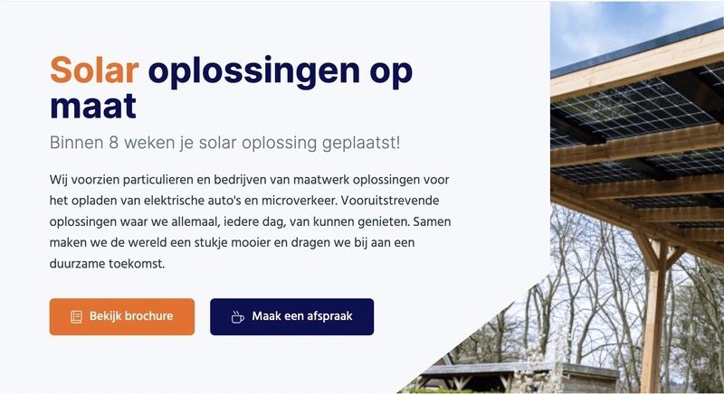
For instance, the web builder has made it easy to add buttons and pop-up forms on every page. The website has also been enhanced with blocks for projects, reviews and frequently asked questions, making it much easier to showcase Shift to Solar's expertise to a potential client.

New WordPress design

No URL structure or subnavigation was possible

The old website had some major drawbacks. There was a flat website structure zonder subnavigation, which meant that all pages were at the same level. For both Google and the user, it was difficult to navigate the website. Many pages received an internal link only through the footer. Both individuals and businesses ended up on the same page, so both were not properly addressed (a conversion killer!).

We felt it was important to be able to work with an extensive menu and subcategories in a new website. This addition allowed us to come up with a logical URL structure for the new website and allowed us to split the menu between services for individuals and businesses.

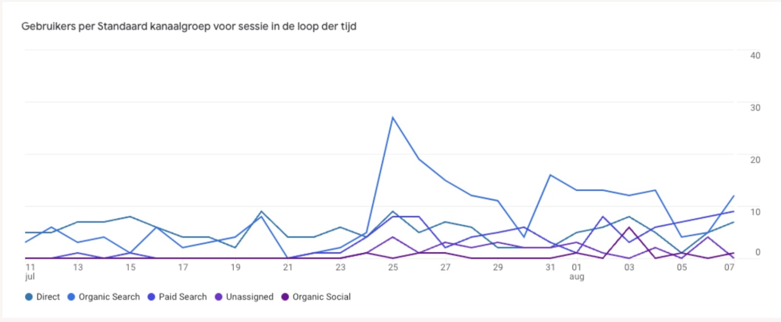
The two target groups are now better addressed on the website, which has a positive impact on both organic traffic and conversions. Some searches belong to businesses ('solar carports') and others fit better with individuals ('home carport'). In GA4 after launch, we saw a 125% increase in users and a 131% increase in sessions with engagement.

increase of 125% in users

Pages consisted largely of plain text

Google not only looks at the content on a page, but also at user behaviour. When there is little to no interaction with a website, this sends a negative signal to Google. You can imagine that pages with plain text and maybe one image, are not very inviting to read further. Moreover, it gave us few opportunities to show expertise or build trust in the content.

We felt it was important to make the pages more interactive and to be able to expand them with different types of content. You can think of adding a block with frequently asked questions, reviews and projects of satisfied customers. This makes the content come alive much more and people don't have to struggle through a large chunk of text to get all the information they need. Different content blocks increase the interaction with a page, but also the scannability of the text.

Objectives

The process went exactly as we like to see a migration. Some of the steps:

  • Setting up URL structure
  • Mapping all old URLs and creating the redirect file
  • Identify current technical issues and brief them to the web builder
  • Design feedback
  • Meetings to discuss the website with all stakeholders
  • Transfer content and optimise it immediately
  • Adding CTAs

After going live:

  • Checking measurability
  • Contacting social media party for the custom URLs
  • Monitor GSC for 404s or other errors
  • Monitors GA4
  • Crawl rotated for resolving technical errors
  • Clarity analyses to see if people are up against something
  • Search terms updated and content further expanded

This ultimately resulted in an increase in visitors (+90%!) and an increase in conversions.

Completion

The collaboration with Shift to Solar has shown that a migration does not necessarily lead to a (temporary) dip, but can also have an immediate positive impact on organic growth. The migration to WordPress, with its extensive options for content blocks, sub-navigation and conversion optimisation, was a hit! Both we and the client are very pleased with the results achieved.

Result

  • Doubling of organic traffic
  • More top five positions than ever
  • Main keyword from position 9 to 5
  • Conversions quadrupled

Any questions?

Do you want to know more about SEO? Could your website use a new boost?
Get in touch

This is us!

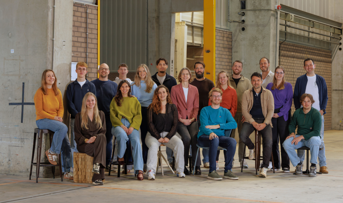
A team of SEO specialists

Our team consists of enthusiastic SEO specialists who are happy to work with you for the best results.

Meet our team
SEO office Onder Zwolle

Read our testimonials!

Renzo van Dongen

Renzo van Dongen

Digital content manager Peugeot

Whether it's about content or technical adjustments, it doesn't matter. Martijn briefs this in a very clear way so that it can be implemented locally or by our head office in France. [...] Since the start of our collaboration, we have achieved great results. Keep it up!

Marien van Stegeren

Eigenaar Kitcentrum

When your online onder venture grows, expectations often grow too, in every area. To a large extent, we were in control of SEO and its interpretation ourselves. We found out that our own "general view" was no longer sufficient, so we engaged Bureau Onder. Surprising and clear. We have built up a fine collaboration, partly because Martijn also regularly visits our office with Eline or Mariska (depending on the case), which is very valuable to us!

Marten Stellingwerf

Webmaster

Martijn and Mariska make the SEO story understandable for the layman and are happy to think along with us. It is nice that there is a personal contact moment every month with an extensive report and the opportunity to talk everything through. After just a few months, Onder has already managed to achieve number 1 positions on Google with some of our webshop pages. We are very satisfied with Onder.

Mark Prummel

SEO Specialist Stella Fietsen

For several years, Onder has been a valued partner of Stella. Martijn is my sparring partner for complex SEO issues and the extra pair of critical eyes that keeps us on our toes. Together, we have achieved nice growth in online visibility, visitor numbers and leads. Onder onder stands out for its short lines of communication and professionalism. They speak our language: don't nag, get down to business. That is what we love!

OnderBouwing

PLEASE NOTE: DUTCH NEWSLETTER
  • Insights on SEO
  • For beginners and advanced specialists
  • From experiments to developments at Google and from
    best practices to our own cases
  • A look behind the scenes at Onder

"*" geeft vereiste velden aan

Dit veld is bedoeld voor validatiedoeleinden en moet niet worden gewijzigd.